

How to Resize & Crop Images in Squarespace 7.1

Making images smaller and editing them on Squarespace websites can be a bit confusing, so I’m sharing a few ways to do this easily.
Resizing images is of the things my website design clients seem to get stuck on quite regularly in Squarespace, because it can be a bit awkward unless you know exactly what you’re doing!
Table of Contents
Watch this on Youtube (or keep scrolling to read)
Preparing images for your website
If you’re stuck on actually finding the images in the first place, my blog post about using images on your website will be the best place to start!
It also covers how to prepare your images to upload to your website, because this is actually really KEY in helping the loading speed of your website, and has a big effect on your SEO - so definitely have a read first.
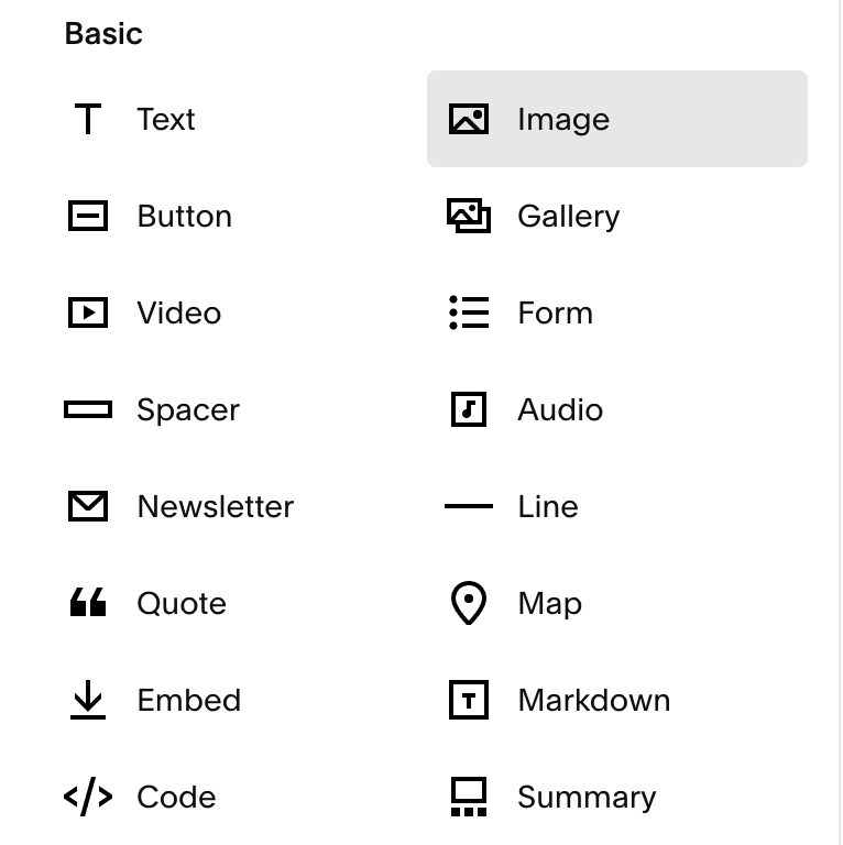
How to add an image to a page
To add an image to a webpage in Squarespace, simply hover over where you want to add the image until a blue line and ‘+’ button appears. Click this and select Image Block from the list of content blocks available.
Here, you can click the upload button to upload an image from your computer, or choose to browse the library of free stock photography to use one from there.

Resize images using ‘spacer blocks’
Once you’ve added your image block, you’ll probably notice that it appears quite large, because it will automatically span the full width of the column of space you’ve added this content block to. This is where you’re probably wondering how to make it smaller, or resize it to fit the space you want!
If you click the blue ‘+’ button underneath the image block, and add a Spacer Block, what you can do is click and drag on this Spacer Block and move it to create a new column to the left or right of the Image Block. When you release your mouse to drop the Spacer Block there, you’ll see it automatically creates space to that side of the Image Block, making it smaller.

You can do this on one side, or both sides of the Image Block, and if you hover in between the columns of blocks (ie. in between the Spacer Block and the Image Block), you’ll notice a double-sided arrow appear. If you click and drag this to the left or right, you can then alter the column widths - therefore creating more space for the Spacer Blocks, and less room for the Image Block, which will make it smaller.
Pros of this image resizing option:
Relatively quick to do to make images smaller
Cons of this image resizing option:
Can be fiddly when you’re not used to dragging & dropping blocks, and editing column widths
You’re restricted by Squarespace’s column layouts
Doesn’t apply on mobile devices because Spacer Blocks don’t load here
Resize images using custom CSS code
You can also use custom CSS code to edit image sizing in a way that isn’t restricted by Squarespace columns, and can also apply on mobile devices.
To add custom CSS code to your website, you’ll need to go to Design > Custom CSS in your Squarespace dashboard, and add the code here.
Resize all images
Paste the below code into the Custom CSS area:
.sqs-block-image {
  width: 90%;
  margin: auto;
}
You can change the % to be a lower % if you would like the images to be smaller than this, or higher for larger.
Resize specific images
To target specific images on your website so that it doesn’t apply to everything, you’ll first need to find the ‘Block ID’. The easiest way to do this is to download the Squarespace ID Finder browser extension, which you can then click on and it will show you the ID for each block on your page.
Click on the block ID for the image you want to resize and it will copy this to your clipboard. Then go to the Custom CSS area and paste in the code below:
#blockid {
  width: 90% !important;
  margin: auto;
}
^ But replace ‘#blockid’ with the ID you just copied to your clipboard.
Pros of this image resizing option:
Gives you 100% control over image sizes on desktop & mobile
Cons of this image resizing option:
You need to be fairly code proficient to do this
It’s very time-consuming to alter this for each image
Resize images using Squarekicker! (Easiest option)
Squarekicker is my FAVOURITE Squarespace extension that I recommend to all designers and those wanting to go further with their Squarespace design. You pay a monthly subscription and install it onto the website you’re working on, and it adds TONNES of incredible design options that would usually only be possible with hours of coding. However Squarekicker* displays it all in an easy interface, so you don’t need to know any code to use it.

To resize an image, simply click on the ‘SK’ button next to your Image Block (once you have Squarekicker installed*) and choose to edit either the ‘Image’ or the ‘Block’. I usually just go with editing the block as a whole, rather than just the image.
Then go to Layout, and here is where you can easily edit the width of the image!

Pros of this image resizing option:
Super quick, easy and intuitive
Not restricted by Squarespace columns
Can control sizing on all devices
Cons of this image resizing option:
Squarekicker is a third party tool that requires a monthly subscription (but it’s SO worth it in my opinion!)
Further reading: Check out my full Squarekicker review here!
Resize images on mobile only or for different devices
The only way to resize images on specific devices or screen sizes (without it affecting how it looks on the other devices or screen sizes) is to either use custom code or Squarekicker* (as mentioned above).
To use code that targets a specific screen size, you’ll need to use a CSS media query around your image resize code (that I’ve shown you above).
This is what a CSS media query looks like:
@media only screen and (max-width: 600px) {
[insert code in here]
}
And to edit the screen size you’re trying to target, you would change the ‘max-width’ to be something else, like 800px or 1000px.
So your original code becomes:
@media only screen and (max-width: 600px) {
#blockid {
  width: 90% !important;
  margin: auto;
}
}
^ Using your specific Block ID as I mentioned above, of course.
Or as I say, the easiest way is to use Squarekicker*, because you can select which device/screen size you want and edit the settings specifically for that (and it won’t affect the other sizes).

The Difference Between Resizing and Cropping an Image
When you resize an image, we’re generally talking about changing an image to make it smaller in the space, or make it bigger so that it takes up more space. This involves changing the height and width of the image uniformly.
Meanwhile, cropping an image involves changing the shape of the image, by altering the height and width ratio. For example, the ratio of a square image would be 1:1 (because the height and width are equal), but if you wanted it to appear as a landscape rectangle, you would need to ‘crop’ the height so that the height is less than the width (eg. a 3:4 ratio).
Crop images using the crop slider or image editing tools
If you’ve added an image to your page and you’ve realised it doesn’t work in its current 'crop format’ (ie. is it square, a landscape rectangle, or portrait rectangle for example), you can adjust the height straight within Squarespace’s page editor by hovering over the bottom of the Image Block until this grey circle appears.
Click on the grey circle and drag it up or down, and you’ll see you can alter the height, and therefore crop the image.

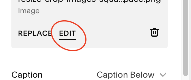
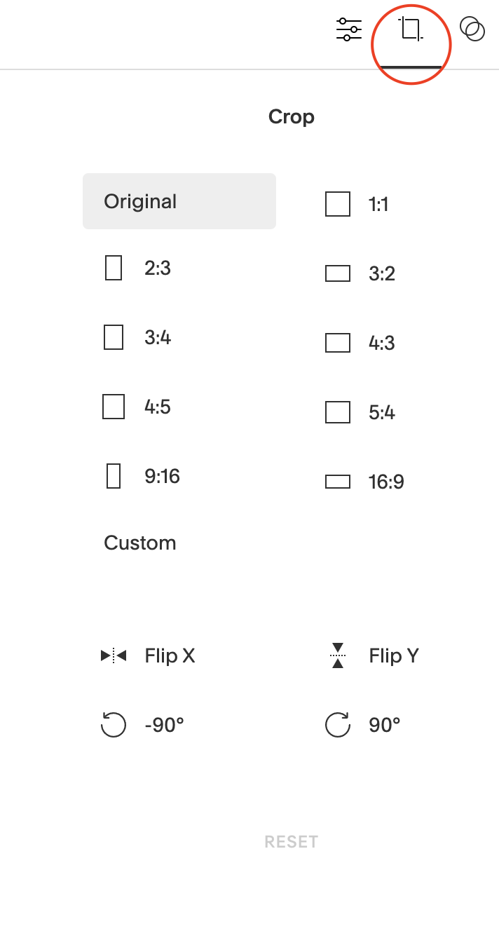
Alternatively if you click to edit the Image Block, you can also click the ‘Edit’ button and this will give you some cropping options as well if you click on the crop tool in the top right corner. This gives you some different ratio options.
Crop images into a circle using image design tools
In Squarespace 7.1, you can now edit your images into totally different shapes such as circles, arches and more. If you edit the Image Block and click on the ‘Design’ tab, you’ll be able to find some new shape options here by clicking on ‘Shape’.

Or you can also edit the corner radius’ of your image to crop the corners too.

I hope this helps you with editing images on Squarespace!
*indiciates an affiliate link