

How to Keep People on Your Website for Longer (and Reduce Your Bounce Rate!)

So you’ve got website traffic - congrats! But how long are people actually hanging around for?
If you’ve checked your website analytics carefully, you might already know the answer, and chances are (seeing as you’re reading this post) you already know that you need to improve it. Having people stay on your website for longer not only means they are getting more familiar with your brand and content, but is also great for search engine rankings too.l
First, analyse what’s currently happening
Take a look at your website analytics. Squarespace has a built-in traffic analytics section, but I’d recommend connecting to Google Analytics as it gives much more in-depth and detailed data, perfect for activities like this. The information we want for the purposes of this article, is under the Behaviour section. You want to be able to see your:
Bounce Rate (%)
This is the percentage of people who land on your website, and leave either straight away or after viewing just that one page. They haven’t clicked on any links on that page or visited any other areas of your site - just the one they landed on. The higher the bounce rate, the more people are leaving your site after seeing just one page. You want to aim for a low %!Pages per Session
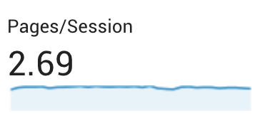
On average, how many pages are people looking at during one ‘session’ on your website (one session = one visit to your website; people can have multiple sessions per day while some will only ever have one session on your site). The more Pages per Session, the longer people are staying on your site.Average Time on Page
On average, how long are people spending on your pages. Obviously longer is better here!
These numbers are useful, but don’t be totally put off if you’re not ‘scoring’ very well! It can depend what type of website you have and what the goals of your website are. For example:

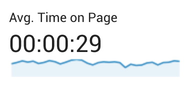
I run a blog that has an extremely low bounce rate, and a good Pages per session number, but the average time spent on each page is under 30 seconds! At a first glance you might worry that people aren’t taking in any of my content or really absorbing what’s on there BUT I know that it’s probably because it’s primarily a photography-based blog so people will just be scrolling through quickly looking at photos and moving on to the next post.
Meanwhile, for this website, the bounce rate is pretty damn high! I would obviously love for this to be lower, but I’m not too worried because I can see that people are spending a good few minutes looking at my content AND I know that the bounce rate is because I have a few ‘freebie download’ landing pages that perform well on Pinterest, so I get a lot of people visiting just to see that landing page and download the freebie, then leaving again.

So as you can see, you need to take these figures with a pinch of salt! That being said, it’s always worth having a go at improving, so below are my best tips for getting people to hang around…
Watch this as a youtube video (or keep scrolling to read)
Understand your visitors’ journey
Creating the perfect user journey on your website is pretty much an art form and a science all in one! I have a whole blog post dedicated to mapping out your website visitors’ journey, and once you have this in the bag, you’ll know exactly where you want your visitors to and which pages you should be directing them to.
Write compelling headlines & copy (questions, rhetoric)
Grabbing peoples’ attention is one thing, but retaining it for a length of time is another. You can use compelling copy throughout your website to get your visitors thinking and feeling, until they become fully engaged with your content. Use questions and stand-out text, and tell them a story that they can relate to.

I always seem to use Jenna Kutcher’s website as examples, but just look at how dynamic and interesting it is! It really compels you to stay a while and read more.
Pique curiosity WITH A DYNAMIC LAYOUT
If someone lands on your page and just sees huge blocks of text, it’s going to put them off and they’re likely to ‘bounce’ off pretty quickly. In contrast, if you’ve laid out your pages in an interesting way, using graphics, imagery, colour and different fonts to guide the reader through your content, it’s much more likely they’ll stick around.
There are other ways of getting them interested in what you have to say (other than just using a pretty layout); why not pique curiosity by being really unexpected. Challenge peoples’ assumptions with a bold statement, illustration or a fun feature on your website.
Always include a call-to-action
What do you want visitors to do once they’ve landed on your website? We want to keep them on the site for longer, but where do we want them to go? This obviously depends what you’ve planned in your user journey, but make sure that you always include a Call To Action on every page to lead to somewhere else that is going to be equally engaging and not lose anyone from your site.
Internal linking in blog posts & pages
Notice how throughout this post I have been linking to old, relevant blog posts throughout? Obviously it provides a useful reference for my readers but it also means people are more likely to click to read another article, and spend longer on my site. Internal linking is also great for SEO, but consider how you could use it on other pages too - not just your blog!

Example of internal linking on my Website Design page
For example, on my Website Design page, I have several links to my ‘Process’ page, my ‘FAQ’ page, and my contact page to book a project too.
SET EXTERNAL LINKS TO ‘OPEN IN NEW WINDOW’
If you link to anywhere else on your site (maybe to another article, a partner business, or a client case study), always set the link to ‘open in new window’. In Squarespace you can check this when you add a link very easily, and the same goes in WordPress too. This means that people aren’t taken away from your website - it stays open in their browser, and another browser window pops up with the link to the other site.

Keep pop-ups, ads and intrusions to a minimum (especially on mobile!)
I’d always suggest keeping pop-ups and ads/announcements on your website to a minimum. There’s nothing wrong with a subtle newsletter pop-up if there’s a good reason for people to sign up, and there’s nothing wrong with adding an announcement bar to your website to draw peoples’ attention, but I'd advise against using much more than this as it can make your site feel busy, cluttered, and the visitor will be overwhelmed with decisions & choice.
Once you add in a live chat bot (a very commonly used tool in plenty of businesses) that adds a tab at the bottom of the page, plus a cookie policy pop-up, and they’re all taking up parts of the screen before the user has even read a sentence of your own content, it’s very easy for them to be put off. Be very wary of how many distractions you have going on. Cookie banners can be extremely discreet - there is no need to have one that takes up half the page.
And PLEASE always check what it looks like on mobile! These things on a desktop may not seem that intrusive, but once it’s all fighting for attention on a tiny screen, it can look ridiculous, and will definitely have people turning away instantly.

Example of super intrusive cookies banner and overlay ad on the Telegraph website. It looks busy and cluttered, and makes me personally want to bounce straight off!
News websites are notoriously bad for overwhelming visitors with pop-up ads and random distractions. It’s how they make their money, and they don’t seem to care too much about bounce rate as they still get the traffic numbers.
If you take one thing away from this post today, let it be to avoid ever coming across like one of these pushy, overwhelming sites, as it really puts users off!

Cornwall Live has a pop-up ad at the bottom AND a mobile pop-up, which are both in your face before you’ve even seen any content
