

Choosing Fonts & Typefaces That Work for Your Brand

With hundred of thousands of fonts available online, how do you select the ones to use in your brand?
When I'm creating a brand with my clients, it's not just about creating logos and a set of brand marks to use on collateral. My process also involves going through the core personality and goals of the business, and using that to set a visual style with imagery, colour palettes and - of course - fonts & typefaces.
What is a font and what is a typeface?
Firstly, I just wanted to clear up the definition differences between the word 'font' and the word 'typeface'. They are almost interchangeable (which is why I'm using them both in this article), but there is a nuance you may be interested to know. I've simplified it as best I can below:
A Typeface is easiest described as the design and appearance of a selection of text. It describes the aesthetic of the text.
A Font is the actual file or product that you might download. A Typeface can be made up of several different fonts (ie. font files, like TTF of OTF) with different weights and styles (eg. bold, semi-bold, light, italic).
My analogy:
We can describe a Typeface as a meal, and Fonts are the foods that make up the meal. The meal/Typeface is what you see and experience, and the foods/Fonts are the actual products that you use to create the overall appearance.
^ It's rough, but you get it, right?
Font/Typeface Categories
Let's start off by sectioning typefaces into different categories, so you can at least start organise the huge variety and choice in your mind!
Serif
A typeface with serifs has small flourishes or lines at the end of each letter/character.

Sans Serif
'Sans' is from the French 'without', so this just means that the typeface does NOT have serifs on the letters.

Display
Display typefaces vary a lot, but are generally considered more stylised. They are intended for use as large text or headings, and usually not for large bodies of text due to being more difficult to read in high volumes.

Handwritten & Script
Technically, script fonts come under the category of Display typefaces, but I thought I'd include them as a separate one because they're so popular at the moment! These typefaces are designed to look like they've been created by hand, rather than mechanics. Variations include calligraphy and brush, for example.

Font/Typeface personalities
Each typeface has its own personality and associations that people tether to it, and it's important to know what you're putting across with the use of a font (using the wrong one could cause a clash and confusion with your overall brand.
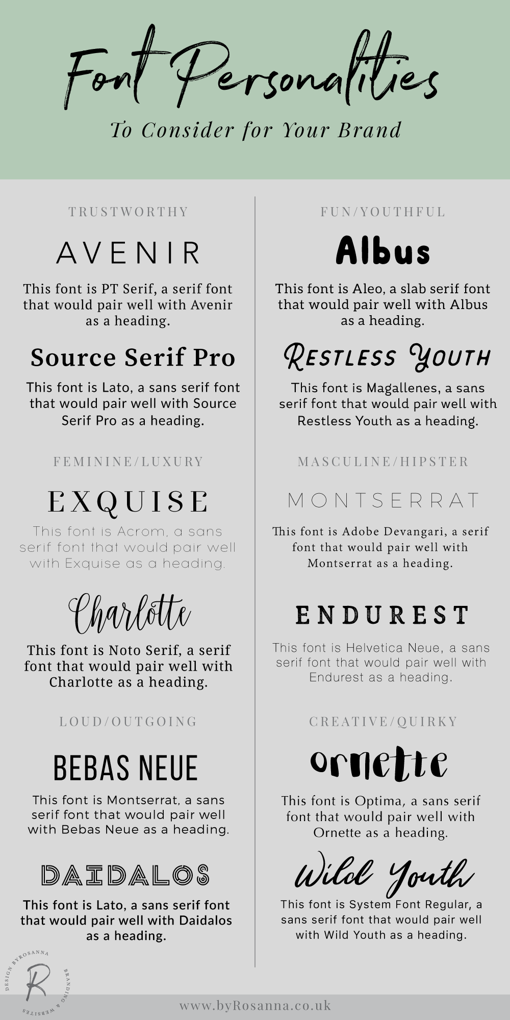
For a Trust-worthy & Professional personality
Serif fonts are traditionally associated with more serious & professional personalities, due to their history in the serious world of book printing. But Sans Serif fonts can work equally well to establish a professional and trust-worthy appearance, as long as they are well-proportioned.
For a Fun & Young personality
I like to use a mixture of Sans Serif or Slab Serif (a type of Display typeface with very straight, block-like serifs) fonts alongside a more personal Display font to get across this kind of personality. Something rounded and with quirky characters included!
For a Feminine or Luxurious personality
I find a Serif font works well alongside a Script font to get across a feeling of luxury or softness. Traditionally something with curls would be seen as more feminine but I usually opt for a more subtle approach!
For a Masculine or Hipster personality
For this, either a Serif or Sans Serif typeface will do for body text, as long as there's plenty of space between the letters. For headings or using large text in a logo for example, I like opting for typefaces that are quite 'short' and compact (ie. the letters appear to look very symmetrical and work well horizontally).
For a Loud & Outgoing personality
Sans Serif always seems to work better for this kind of style; usually a mixture of rounded, open typefaces and bold, condensed fonts works well to create a bold, attention-grabbing look.
For a Creative and Quirky personality
Using a neutral Sans Serif for body text means you can go all out on the headings and larger typefaces! I like to use large sweeping handwritten fonts, or typefaces will lots of unique features.
Also it's important to remember that a typeface can feel like a totally different personality depending on whether it is all capitalised, or maybe italicised as well, so worth trying different variations when possible!
Font/Typeface pairings
Sophisticated font pairings generally work on an unwritten rule that the fonts should be different enough to create a contrast, but not so different that their personalities clash.

^ This example shows a font selection that just contains too many fonts that are of too similar styles. It's overwhelming and as a result, none of them stand out.

^ The big bold sans serif font as Heading One really says something different to the feminine, delicate Heading Two typeface. It's a juxtaposition of character and people are likely to get confused about how your brand is positioned.

^ These fonts are also different, but they all have a trustworthy/professional and modern feel.
Other considerations
Are there webfonts available to use on your website?
When selecting fonts for your brand, it's important to make sure that they will be available to use on your website so that all your branding collateral is consistent. If you are using a Google Font, it's likely that you will be able to use it on your website, either by installing a plugin (for WordPress), or by using CSS to add it manually. If you're using Adobe fonts, platforms like Squarespace allow you to import these, but if you're not using that platform you may need to search for and purchase a webfont file to install.
If you are purchasing fonts from sites like Creative Market or Fonts.com and you want to use them on your website, make sure the package you purchase includes a webfont file.
This is important for serif and sans serif fonts that you plan to use for body text, but with Display & Script fonts, it's often not possible to get webfonts. You can use these on your website instead by creating graphics (in Photoshop etc.) and uploading them as images (like I do on my website with the script font). However, go easy on this technique as it's not great for SEO!
Do you have the right license to use the font?
There are also loads of free font sites where you can download fonts for free to try them out (you may already have discovered Dafont.com, Fontsquirrel.com, or 1001freefonts.com), but be very careful about licenses with these.
Some will allow you to use for free for personal use and commercial use (read more about the different licenses for fonts in this article), but many will require that you purchase the full license in order to use it commercially (ie. in client projects or any situation that isn't just for you personally).
Is it easy to read in a range of situations?
When choosing fonts it's important not to get carried away just because you like the appearance of a typeface and it fits well with the brand personality. At the end of the day the most important thing is for your text to be readable, and that means testing it out in different situations to make sure people understand what you're talking about:
- Test the sizing; how small can it go before it's hard to read? If it's unreadable at 14pt, it probably isn't a good choice for body text.
- Is it readable on screen AND printed? Test the sizing in both print and screen.
- Test it on different backgrounds & colours; consider where you will be realistically using the font (eg. overlaid on dark photos, or on top of textured backgrounds in bright colours).
